7 Most Useful (and 7 Terrible) Business Card Designs
You may have noticed that there are a ton of really creative business cards being handed out by prospective employees, freelancers, artists and small businesses alike. But, does creative = effective? Here are a few of the business card designs we find to be the most effective, and a few that we feel are a wee too inaccessible.
7 Most Useful Business Card Designs
The Mini-Card
 Why this works: This type of business card gets right to the point. Because the card is smaller than a standard business card, your text will stand out much more, getting people to read the pertinent information more quickly. Mini-cards are often cheaper and more eco-friendly than standard business cards. They're also smaller, which saves a lot of space in people's wallets and cardholders.
The Map
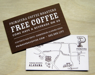
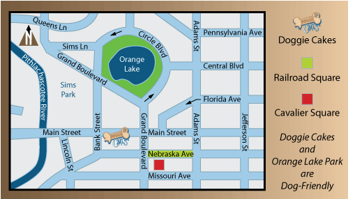 Why this works: The first business cards were originally used in London to direct people to the stores when no formal street numbers existed. People are as lost today as they were a couple of centuries ago. Instead of having to google directions, people can use your business card to find you easily. (For example, I once went to a lunch at a place that had quite a few business cards displayed at the front of house. One card I picked up was for a cupcake place nearby. I was able to use the map printed on the back to get cupcakes afterwards, which I probably wouldn't have thought of doing that instant if the map hadn't been there.)
Menus/Recipes
 Why this works: This naturally works for restaurants and delivery services, but the basic idea behind this design trick will work for any business. Give people a useful piece of information that they can use in the future, and they'll be more likely to hold onto your card longer than they normally would.
Coupons
 Why this works: Again, you want to give people a reason to hold onto your business card. Attaching a coupon to your business cards encourages people to take a few and give them to friends. Remember, word-of-mouth referrals tend to be the most valuable.
Rulers/Measurements
 Why this works: This is along the same lines as the menu. You're providing written information that people could use in the future. This design works great for number-crunchers, architects, designers, contractors, clothing tailors and any industry that deals with custom designs.
Hairpins/Paper Clips/Seeds (Free Items!)
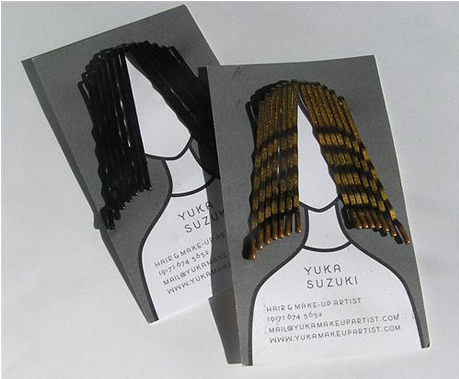
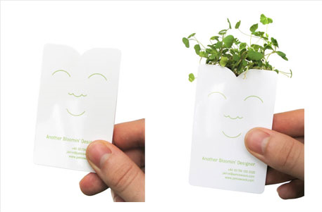 Why this works: People love free things. So, add some useful, tangible and free objects to the design of your business card. Above you'll see examples of free items successfully incorporated into card designs. (The hair stylist's card includes real hairpins, and the other card is actually a packet of plant seeds.)
The USB Drive
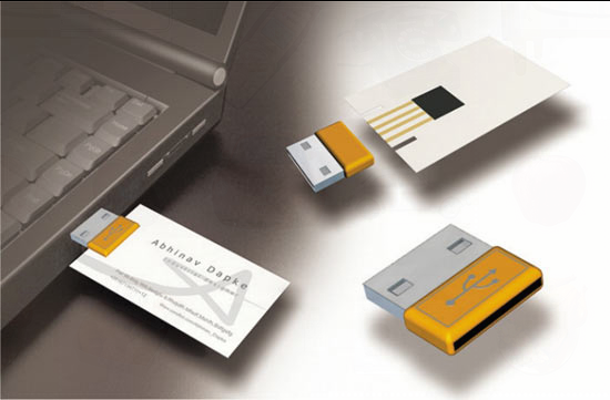 Why this works: Attaching a USB drive to your business card can be tricky, but it can also pay off, especially if you're in a creative field like art, music, performance or film. You can save your portfolio, video or music clips on the USB so that potential employers can access them easily wherever they go. Just make sure that your USB drive is relatively small and is detachable from the rest of the card.
7 Terrible Business Card Designs
The Chunky Card
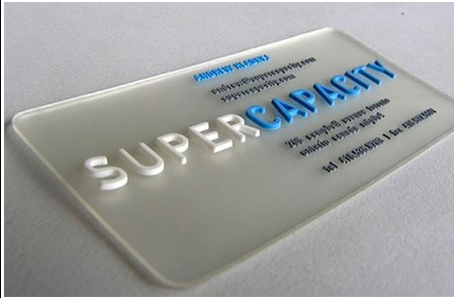 Why this doesn't work: This card has chunky plastic letters because…? Plastic or metal cards might seem cool and unique, but sometimes they're just cumbersome. Try to steer clear of cards that won't fit neatly into a cardholder, wallet or card binder. I'm not saying it can't be done, but exercise caution.
Google Me
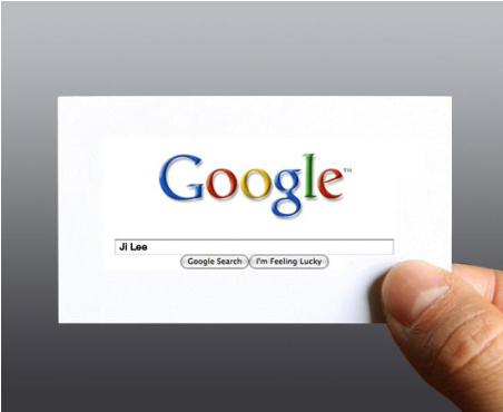 Why this doesn't work: This card has been around for a while now, and while some might think it modern and cool, we think it's terrible. If you hand me one of these things, you'd better work for Google; otherwise, I'm going to lecture you about wasting paper and ink just to be condescending. I'm going to google your name anyway and probably write your number on a piece of paper, you idiot, so please just write your down name, title and phone number for me. Thanks!
Facebook Me
 Why this doesn't work: Please see above.
The Hard-to-Read Font
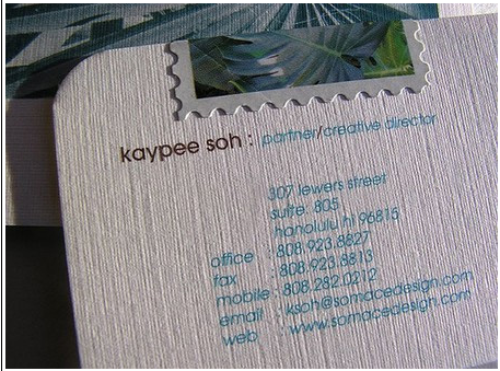 Why this doesn't work: Sometimes you think a particular font or font color would look lovely on a business card, and then you get a card with illegible text. Stay away from light fonts on light backgrounds and dark fonts on dark backgrounds. Also, be aware that textured card stock can make your text difficult to read. It's important to note that when you order business cards online, the preview will often look more legible than the actual card.
The “What do I do with this?” Design
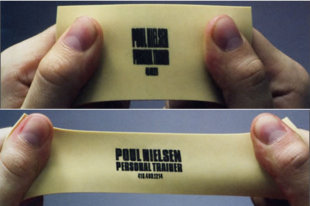 Why this doesn't work: You shouldn't have to explain to me what I need to do with this business card in order to read your information. The picture here shows a stretchy piece of rubber handed out by a gym for people to use to exercise. So, should I stretch this card out with my hands and call you with my foot?
Peanuts
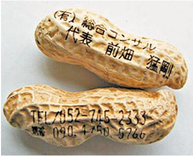 Why this doesn't work: I'm not exactly sure how they were able to print on peanuts, but somehow they did. Edible foods generally do not make good business cards. The same goes for perishable items like pencils, erasers, napkins, wrappers and anything that can be thrown in the trash. Free items are a good idea, but they should be separate from the actual business card/information.
MeatCard
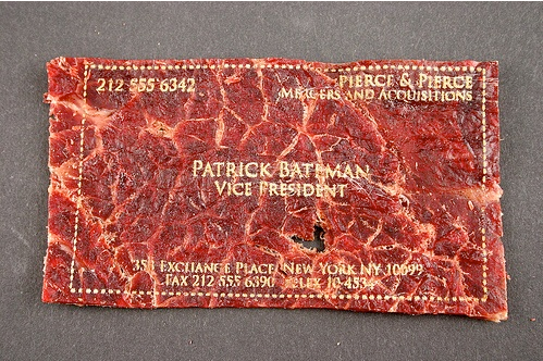 Why this doesn't work: This is really, really weird. I'm not sure who would want to carry around a piece of jerky with words on it around with them. It'd make for a good gag gift, but if you're gonna go the animal route, leather is definitely classier.Are you ready to design the perfect business cards for your small business? Check out our reviews of Business Card Printing Services.

